v0.23: data insights & white-labelling

Version v0.23 of FlexMeasures adds more data insights on the sensor page, so you can understand faster what datasets you are working on. We also added white-labelling, so you can automatically style the UI in the branding of customers. Finally, the flex-context and flex-model are (still) growing more powerful in terms of expressing dynamic information.
This was actually a lager release. For anything else, see the changelog for a complete list.
Let's dive in!
Data insights on the sensor page
The data sets each sensor stores are what sits beneath the scheduling. If the data has low quality, so will your schedules. We saw in projects how true this is, and wanted to show ourselves and customers quickly what actually is stored in a sensor.
We made two crucial additions to the sensor page in FlexMeasures.
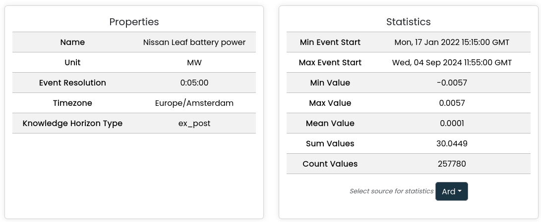
First, we now summarise what the sensor is about (sensor properties), and what data you find (statistics):

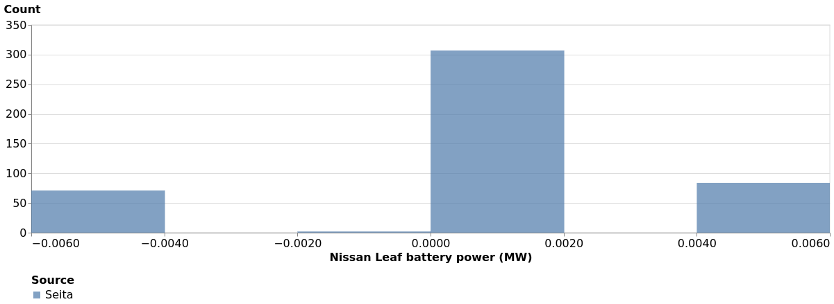
Second, we added a histogram. Sometimes, that is the best way to understand what values you can find in general:

This work was done in Pull Requests 1115, 1116, 1143 and 1148.
White-labelling
We have partners who want to present schedules and reports in FlexMeasures' UI, even if we are hosting FlexMeasures for them. They would love to brand the UI in their colors and logo.
For this, we added the ability to set primary and secondary colors for each account, as well as a logo URL. Here is a simple (not necessarily beautiful) impression of how FlexMeasures' UI will adapt:

This also brings the ability to edit account settings (like the name).
This work was done in Pull Requests 1137, 1145 and 1152.
More expressive flex-context and flex-model
Within FlexMeasures, the flex-context is crucial: it tells us site-relevant parameters such as pricing and grid capacity limits. The flex-model is evenly important: it tells us about the situation on the ground (e.g. current state of charge, limits to it, set points, ...).
Expressing these is thus a regular task when modelling a site in FlexMeasures and asking it for schedules. That should be developer-friendly and powerful. E.g. a site constraint can be a static kW value, but also point to a sensor, where the different capacities per time of day are recorded.
In v0.23, we made substantial progress on both goals.
We merged existing approaches in a single schema, VariableQuantityField (we also made sure we remain backwards-compatible for a while).
Now, across all of flex-context and flex-model, there are different ways to tell FlexMeasures about the optimization problem:
- As a constant quantity, such as:
"10 kW"Note that the unit is part of the message. This is the most direct & easy way. - As a time series, such as:
[
    {
        "value": 51,
        "start": "2024-02-04T10:35:00+01:00",
        "end": "2024-02-05T04:25:00+01:00"
    }
]
This is making it easy to describe temporary blocks, e.g. a few hours where the state of charge should not go below a certain value.
(NB this example assumes the unit is specified via a separate field). - As a sensor, such as:
{
    "sensor": 101
}
In the last example, the data's meta information (such as units) is stored in the sensor objects, and the data is looked up via the sensor table. This is best for highly dynamic data, e.g. prices loaded by a third-party API.
This work was done in Pull Requests 1127 and 1138.
One more thing in this domain: We can also now express prices as fixed quantities - they were always modelled as series before. Sometimes that is what is needed to test a control strategy. See Pull Request 1028.
Faster asset & account page
When a lot of accounts and assets are added, we noticed that FlexMeasures took too ling for admins to load the complete lists. We addressed some speed bumps and also added pagination in the asset API and UI, so that the user experience improves.
See Pull Request 988.
Adding titles to graphs
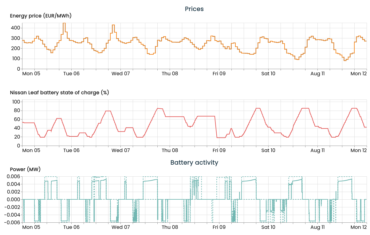
The graphs on the asset page are the go-to place for watching schedules next to the underlying data. Basically, there we find the data dashboard in FlexMeasures. The sensor_to_show attribute which directs the setup of this dashbaord became more powerful.

"sensors_to_show":[ {"title": "Prices", "sensors":[58, 70]}, 16, {"title": "Battery activity", "sensors": [5, 4]}, 15]See Pull Request 1125.